It's a good thing I visited the European side on my third day to the World Expo because if I'd come here first, I would probably spend all my time in this zone and miss all the others.
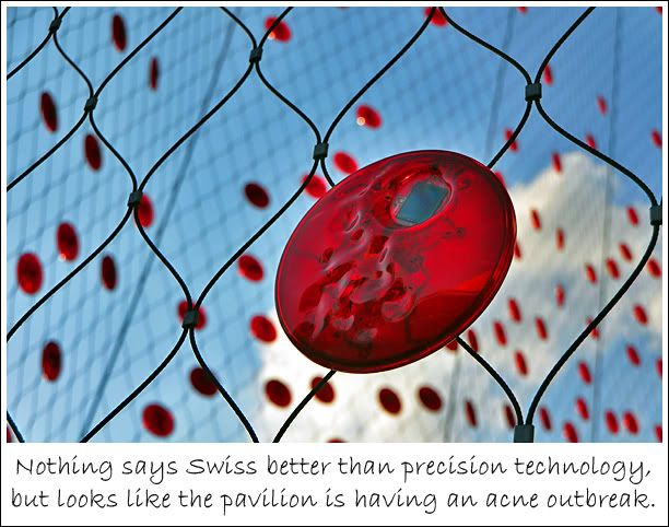
The only disappointment was Switzerland's pavilion which had me scratching my head about its veil of red discs and exhibits that left me feeling shortchanged for the amount of time I queued to get it (about 1.5 hrs). Moreover, its key attraction, an upward-spiralling chair lift system that takes visitors on a roof-top joyride through a planted meadow was under repair. When I realised it took me only 10 minutes to be done with the pavilion, I was like "what the fart luck!".
Anyhoo, here are five of the more interesting pavilions (excluding Spain) among all the European stops I made. Check out the videos for some pretty cool use of projection on unconventional and 3D surfaces.
Unlike video projection onto a flat screen which is very straightforward, these odd shaped projections require careful masking and stitching for the projected show to appear smooth and seamless. So these shows and animated sequences are superb for the technical difficulties they managed to overcome to achieve proportionate realism.
Finland Pavilion
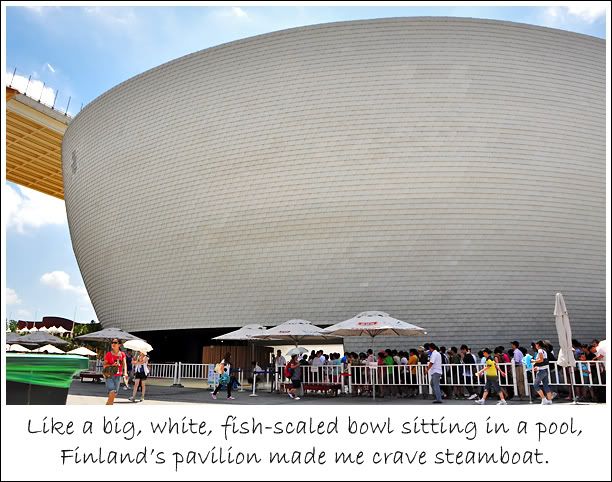
Talk about contemporary Zen on a grand scale and there's Finland Pavilion. Contemporary wha'? Well, there're basically to styles of Zen - the natural-rustic (think rock pools and bamboos); and the contemporary-minimalistic (think white and wide).
The Finnish pavilion took a little of both elements with its gentle bowl-shaped design embellished with a fish-scale texture sitting on a sheet of water and the country's name carved into a large rock. I felt at once close to nature, but not far from urbanity.
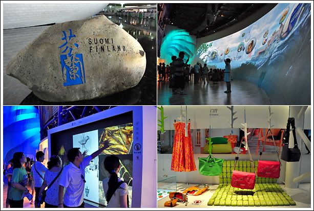
Inside Finland's pavilion, I got visually whisked away by floating dandelions and whimsical bubbles. If you took a digital photo at one of its multimedia kiosks, your face could appear in a bubble gliding across the curved projection screen at the opposite side. Soft, light music chimed the air. Felt kinda enchanting and magical if only I could have the whole place all to myself!
The most interesting find at the pavilion has to be the Ice Age Water. It costs about S$3.00 but I just got to try before the prehistoric pool gets sucked dry. I mean, if it's been trapped for 8,000 years and the size of the pool is finite, how long before it gets depleted?
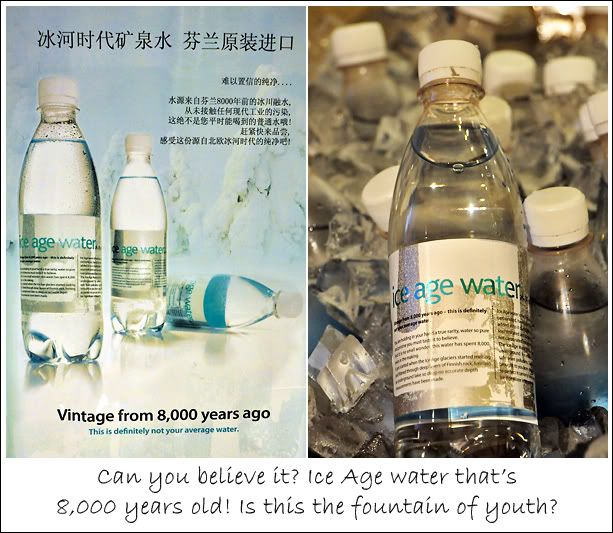
But come to think of it, isn't all our water age old? We constantly ask how old our land is, but no one ever asks how old our water is. Water evaporates, forms clouds, falls as rain, snow; forms rivers, oceans, some get trapped underground or as icebergs; gets drunk, becomes pee, evaporates again, come back on earth again... seems like we have a fixed body of water that's been going through the same cycle for as long as time on earth existed. So isn't all our water ice age? Or even older?
So what does Ice Age Water taste like? Just like any other water except that it felt a little denser on the tongue, perhaps from dissolved minerals. It's slightly carbonated and sold ice cold... a delicious relic to cool off in the heat. Less than half an hour later, I returned it to the atmosphere.
Poland Pavilion
The Polish pavilion reminds me of those 4-sided paper plate lanterns I used to make during early primary school days. I would cut patterns onto the plates, stick different coloured cellophane paper at the back and staple them together. I would make lots of them and place them around my room. A candle in the middle lighted up my creations. I didn't think of fire insurance then.
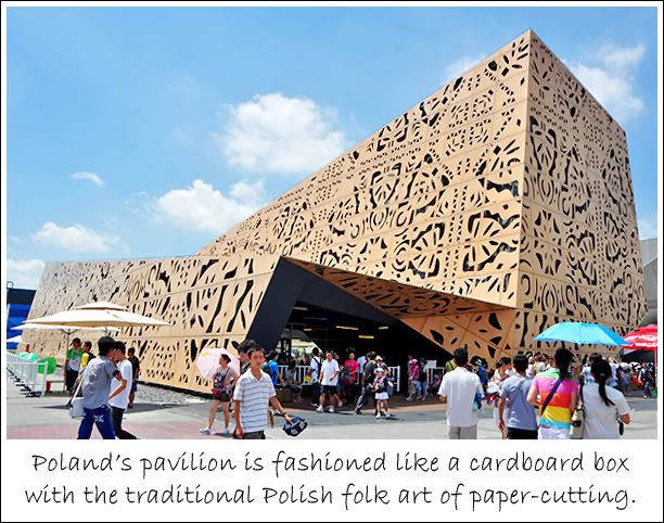
At first, the intricate cuttings made a beautiful mess. But as I saw more of it running along the walls inside the pavilion, I began to develop trypophobia, which is the fear of looking at tightly packed holes such as a lotus pod or shower head. ('Trypo' is Greek for punching, drilling and/or boring holes.)
Okay, I exaggerated but the holes and patterns got pretty heady after a while. There's even a digital dragon fashioned of papper-cuttings. There's too much frieze going on but the interesting thing about this dragon is that it can actually hear what the audience says and respond accordingly!
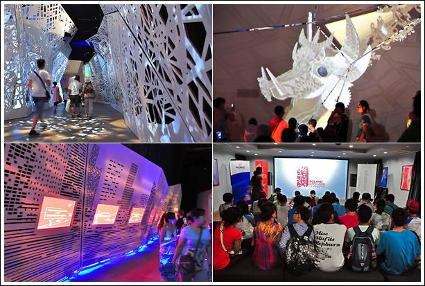
There's also a 3D theatre here although the primitive set-up is a world apart from the details given to design outside and wasn't befitting of the hi-tech production. With a small screen, the awe-senseness of the 3D was loss and I'm not sure if it's due to the glasses that were used, but the effect wasn't as jawdropping as the one at the Thai pavilion. The Thai 3D glasses were different. The Polish 3D show had great depth to its animation but didn't have the feeling that things were coming at you.
Portugal Pavilion
Portugal used cork to build its pavilion's wall not without meaning. With about 52% of the world's cork supply coming from Portugal, it is the world's biggest producer of the material. But beyond the wall, there's little else that could incite curiosity. Except for the clever use of projection to depict the decorative prints of Portuguese porcelain plates.
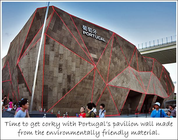
While the exterior held an organic charm, the construction theme wasn't carried to its interior, making it seem rather mis-matched. What's missing was also the grandeur one would come to expect of a nation who conquered much of Southeast Asia during the 15th-16th century.
But if the architectural remanants left in Malacca, Macau, India, and even Singapore are anything to go by, the Portuguese could be said to have a very unsophisticated taste in design. And that's reflected in its pavilion.
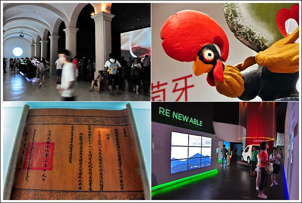
The most curious thing fired my imagination at the pavilion was this... the many funky, colourfully painted chickens that decorated its souvenir section and sold as memorabilias. Why is the chicken a national mascot? Could it be due to the similarity in phonetics between 'cock', a male chicken, and 'cork'?
Well, the anatomy that differentiates a man from a woman shares the same name with the male fowl. Let's see them artify that and use it as a national symbol! ;)
That's too risque. So thankfully, there's a delicious alternative to remember Portugal by... the ever delectable Portuguese egg tarts. Especially those from Macau! Drool~~
Luxembourg Pavilion
Sandwiched between Belgium and Germany, I may never get a chance to visit Luxembourg in my lifetime but being at its country pavilion made me feet like I was there. There's an air of Europeanness about it, and the use of live trees sparsely sprinkled with leaves brought a touch of Mediterranean to the summer sunshine.
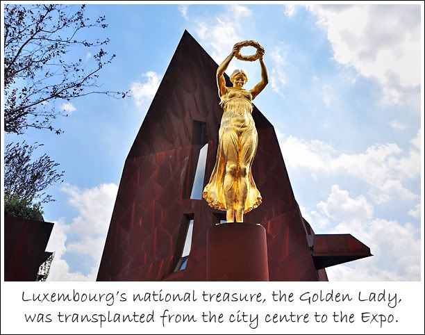
The statue of the Golden Lady gave the European Square a striking human pressence and stood out from the collection of magnificient but impersonal pavilions. I was there at about 2:20pm and managed to take a photo of the sun bursting through the wreath circle. I like that shot alot and you can see it in my earlier post, I Survived World Expo. So if you would like to get the same shot, go around that time.
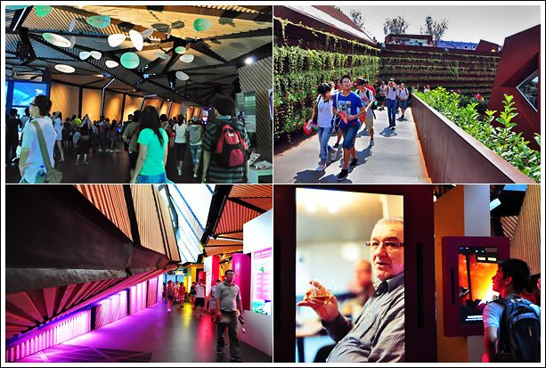
The exhibits inside the pavilion were very straightforward, nothing eye-popping, but the roof-top area provided a nice vantage point to get an elevated view of the European Square and its surroundings. Although nothing fanciful, visiting this pavilion did feel like a walk in the park.
Czech Republic Pavilion
The Czech Pavilion's exterior does not do justice to the exhibits it housed within. It was a wonderland of digital installation art and technology showcase. What's interesting was that quite a number of its exhibits were built overhead, on the ceiling.
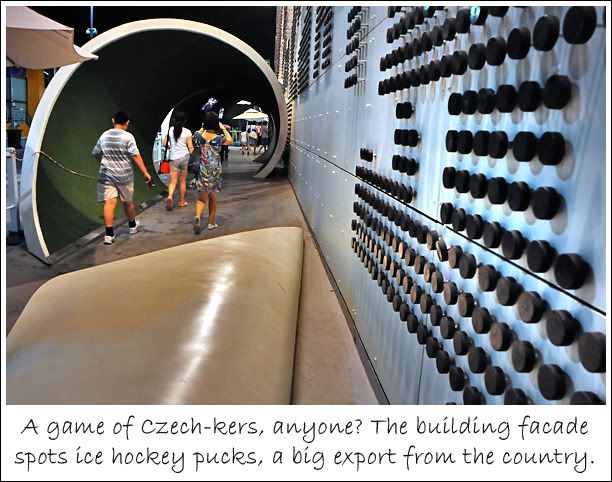
The pavilion was a smorgasboard of visual presentations from holograms tracing the evolution of mankind from caves to sqaure rooms, green screen flight simulation, and a host of artistic interpretations of urban living. Quite a lot of things to see here so it was a very worthwhile visit!
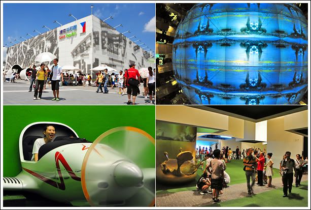
I took quite a few videos here but since I've yet to learn how to edit them into a single clip, I'm posting the ones I captured that don't induce motion sickness...
What the Czech Pavilion lacked in external facade design, it makes up for in the plurality of its exhibits. I wish I had more time and covered more European pavilions, but alas, I have to learn to be satisfied with the Czech Pavilion being the best I'd seen in terms of Eurpoean exhibits.
No comments:
Post a Comment