Forming a square in Zone B with 7 other pavilions (Malaysia, New Zealand, Cambodia, Indonesia, Brunei, Thailand, and Australia), my first impression of the Singapore Pavilion was that it was compact and cut a rather interesting silhouette as compared to the surrounding pavilions. It reminded me of a hi-tech, futuristic durian; its circular design seeming to sit as a small silver disc at this huge world fair (a reflection of Singapore’s position as a little red dot on the world map perhaps?).
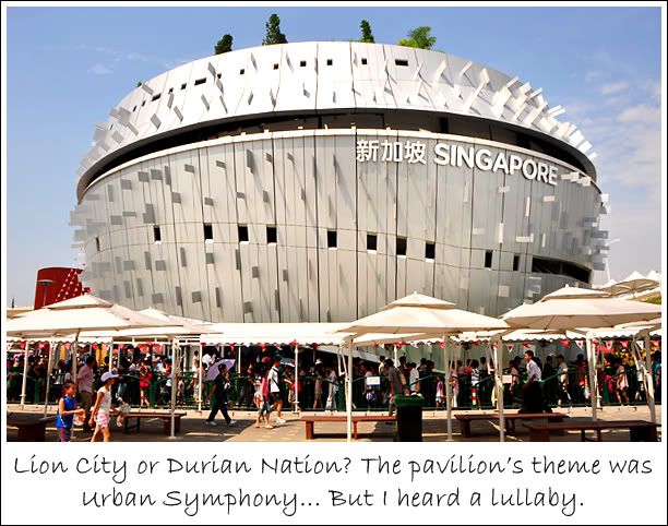
Urban Symphony is the central theme of Singapore’s message at this year’s Expo to encapsulate the harmonious success of our multi-cultural, multi-talent society. The pavilion design is a “Smart Musicbox” (instead of the silver durian I thought it was) and is divided into 3 levels – interactive multimedia stations on the ground floor, a video presentation on the 2nd level, and a rooftop “Hanging Garden”. Click here for more about the Singapore Pavilion.
If you’re a Singaporean passport holder, bring it along to the pavilion for priority entry. Apart from skipping the queue, you can also get your passport stamped with the pavilion’s emblem. My colleague got the stamp on page 45 of her passport to mark Singapore’s 45th birthday. I thought that’s pretty meaningful. Didn’t bring my travel document along so I missed getting stamped.
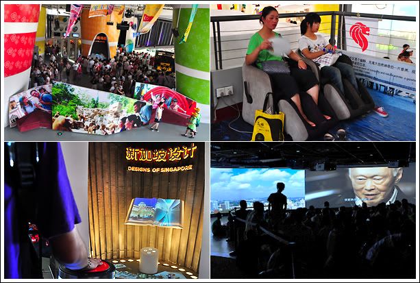
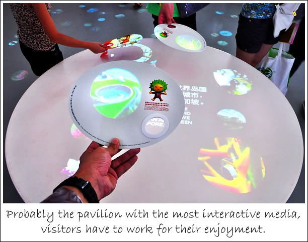
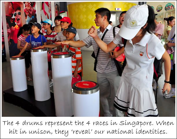
Of all the pavilions I’ve visited, Singapore had the most interactive features such as using an oval card collected at the entrance to ‘capture’ projected images (symbolizes capturing the Singapore dream), a series of 4 drums that activated projections of food, designs and icons of Singapore when hit at the same time (symbolizes unity of 4 races), an arcade-style F1 driving game, and some bo liao 3D animations which I had no idea what they do.
At the Singapore Pavilion, there are very few stand-and-see exhibits. Visitors must do some work in order to fully enjoy the pavilion experience; just as how we have to constantly work in order to survive in Singapore.
While I thought the symbolic intentions embedded into the design of the various interactive stations were clever, I felt their meaning may have been lost. A lot of people, including some of my colleagues, didn’t understand why there’s a need for 4 drummers and those who couldn’t find enough people to play, couldn’t activate the projections.
Moreover, the static projections were kinda small so they lacked that boomz factor. Coupled with the very ‘National Day’ feel of the permanent graphic displays and dull dressing of the pavilion, no wonder the Urban Symphony sounded more like a lullaby rather than a masterpiece.
And to add a bad chord to the sleepy orchestra, the show presentation on the 2nd level could put any chronic insomniacs into coma. The show featured an interview with Minister Mentor Lee Kuan Yew on Singapore's water issues. With all due respect, MM Lee is an interesting speaker to listen to especially on the lessons and reasons behind his decisions made for Singapore. But to devote an entire show to talk about our early sewage problem and how we solved the water problem fitted better in a lecture hall for urban planning. Definitely not in tune with Urban Symphony. While I was there, half the audience left before the show even ended.
I guess at an event like the World Expo, there isn’t enough time to appreciate meaning. People just want to be entertained and wow-ed visually. Then again, the scale and method of execution for the exhibits are inextricably determined by budget.
Costing S$30 million in construction and operations, Singapore’s budget paled in comparison to its neighbouring Australia Pavilion which cost US$75 million in construction cost alone. I’ll post about the Australian pavilion later. It is my favourite from all that I’d seen. (Just as a point of reference, the superhot Japan Pavilion cost US$140 million). Perhaps Singapore’s modest sum was due to a lack of sponsorship interest from local companies at a time of economic recession and uncertainty.
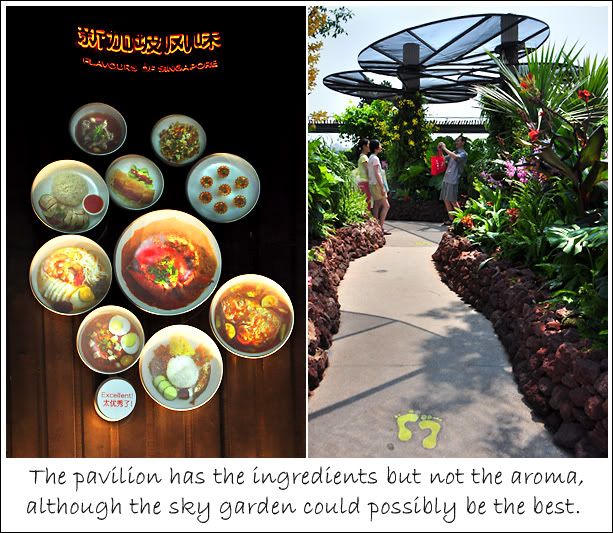
So what’s the best feature of the Singapore Pavilion? I would say it’s the “Hanging Garden”. I didn’t find it interesting at the point of visit but after having seen how some countries attempted to create a garden landscape at their pavilions, Singapore’s very lush and flowery rooftop oasis trumped them all.
On the whole, I wouldn’t say that the Singapore Pavilion is bad, just a tad too intellectual. The pavilion design is unique, but the lack of imagination in interior décor and air-conditioning (only the theatre was air-conditioned) couldn’t sustain visitors’ interest. The addition of a mascot, Liu Lian Xiao Xing (榴莲小星), didn’t help elevate interest and I pitied the person inside the costume during the Shanghai heatwave. (I find that creating a mascot when the product doesn’t need it to be a trait of lazy marketers.)
Nevertheless, even though the Singapore Pavilion didn’t take my breath away, I still take pride in its symbolic message of achieving greatness when people work together; when the different instruments in an orchestra cooperate, we can play a soothing lullaby or an uplifting allegro anytime!
And here’s a musical rojak of a theme song for Singapore’s participation in this year’s World Expo.
For more photos of the Expo and Singapore Pavilion, please visit my album Shanghai World Expo 2010.
No comments:
Post a Comment