27 September 2010

World Expo 2010 - Cultures of a Global Tribe

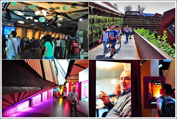
This will be my last post in the series about the pavilions I visited during the Shanghai World Expo 2010. I hope that through the photos, videos and words, it can help bring back memories of the experience if you've been there and serve as an information resource for those of you planning to go before it ends in a month's time.

And for you who will miss the Expo this time round, I hope that by going through my total of 9 entries spanning topics from the rewards and woes of my visitation, to a comparison amongst the ASEAN pavilions, a peek at some European pavilions, and reviews of individual country pavilions, it will feel as if you've been to the World Expo too.

The whole experience was truely amazing. To see countries put aside their political differences and come together in one place was heartening for me. We may be from different countries but our basic needs for safe food, clean water, and stable shelter are the same. We share the same dreams and aspirations for a better life despite the languages that we speak.

More importantly, the voice of environmentalism ran strong in many of the pavilions. Our environment knows no boundaries. We are not immune to each other's actions that harm the land we live in. When forest fires burn in Indonesia, we get choking haze in Singapore and Malaysia. When the US mortgage crisis erupted, we headed for an international meltdown of the financial markets. We may have our own cultures and traditions but there's no denying we are one global tribe.

This post will be different from the previous entries in that there are no reviews about the pavilions. Since the focus is on culture, there's really no way to form an opinion of whether one is better than the other. Our culture is a celebration of us, so in this post, I'll just let the photos do the talking. When viewed with all my other World Expo entries, this should form a nice introduction as the older posts appear after this one. I hope you'll enjoy it...

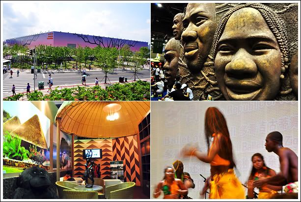
Africa Pavilion

Africa Pavilion

Scene @ Africa

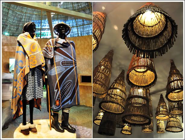
Colourless

Fashionista Afrika!

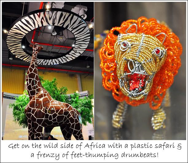
How about this for a pet?

Roar!!

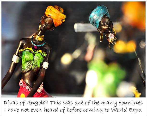
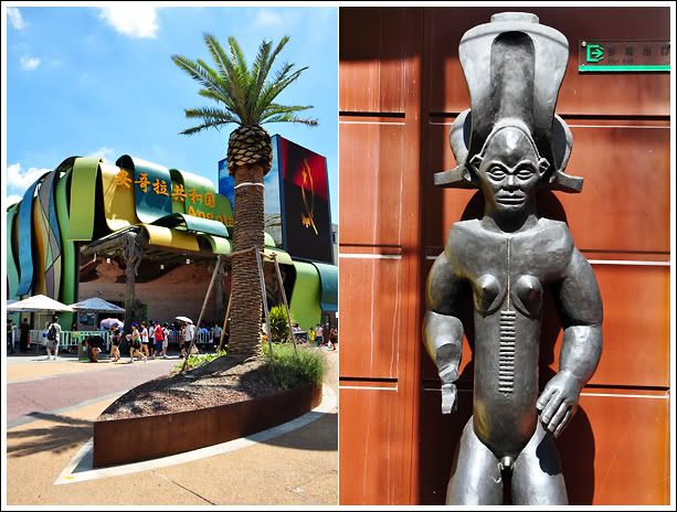
Angola Pavilion

Angola Pavilion

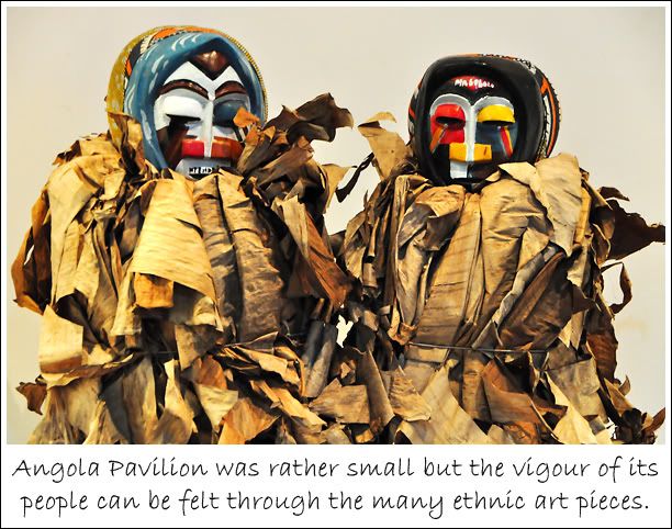
Scene @ Angola

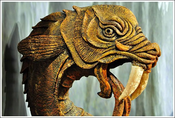
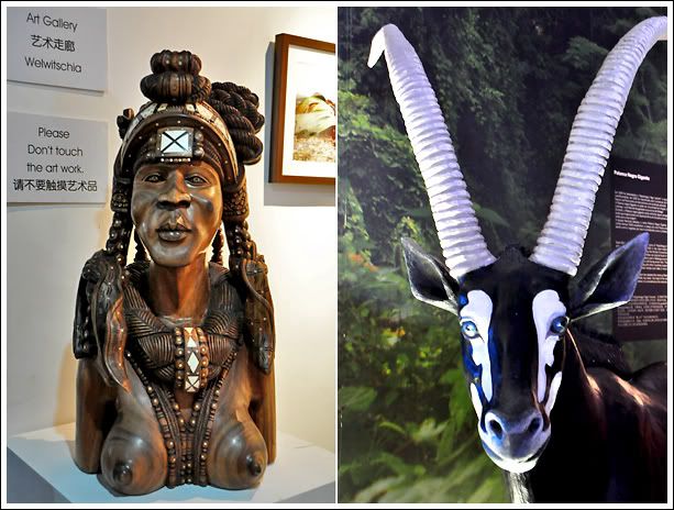
What makes a horny goat?

Somewhat like a small art gallery

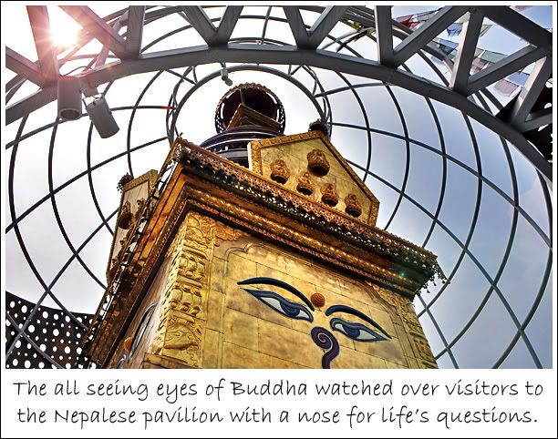
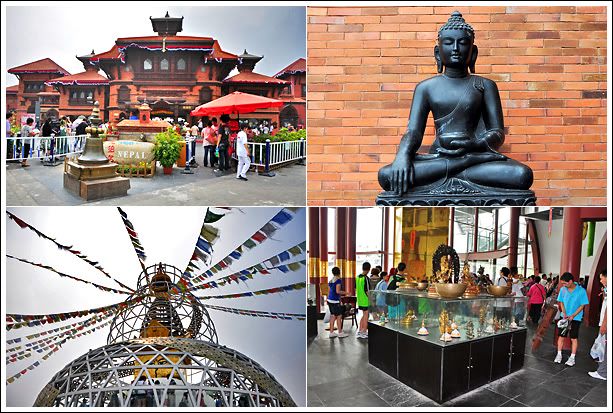
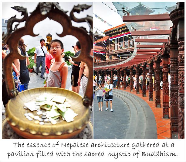
Nepal Pavilion

Nepal Pavilion

Scene @ Nepal

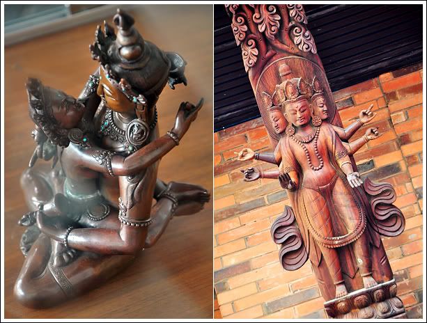
Of gods, devas & Bodhisattva

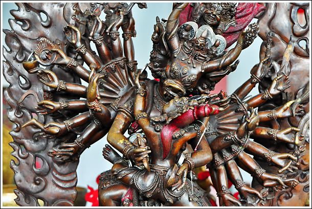
Fearsome sculpture that's sexy at the same time

Felt like in Nepal

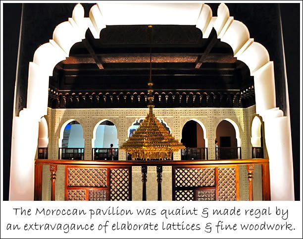
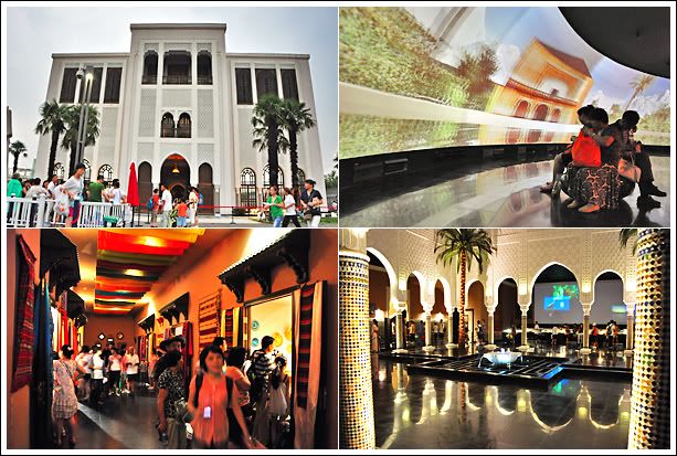
Morocco Pavilion

Morocco Pavilion

Seen @ Morocco

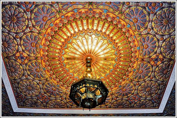
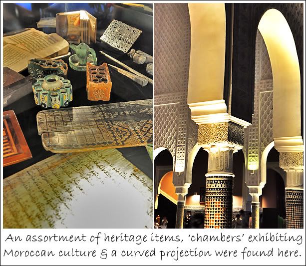
Richly decorated ceiling & walls

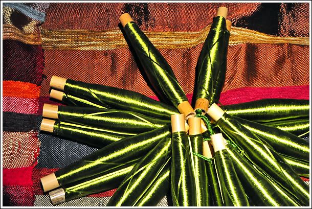
Exhibit on Moroccan thread and fabric

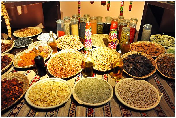
Exhibit on food & spices used in Morocco

A very handsome pavilion with a good showcase of Morocco's culture

24 September 2010

World Expo 2010 - European Pavilions

Strolling around the European avenue of pavilions, I had to constantly suppress thoughts of white supremacy. The ang mohs really do it better when considering the aggregate of their pavilion designs compared to the sum of Asian pods.

It's a good thing I visited the European side on my third day to the World Expo because if I'd come here first, I would probably spend all my time in this zone and miss all the others.

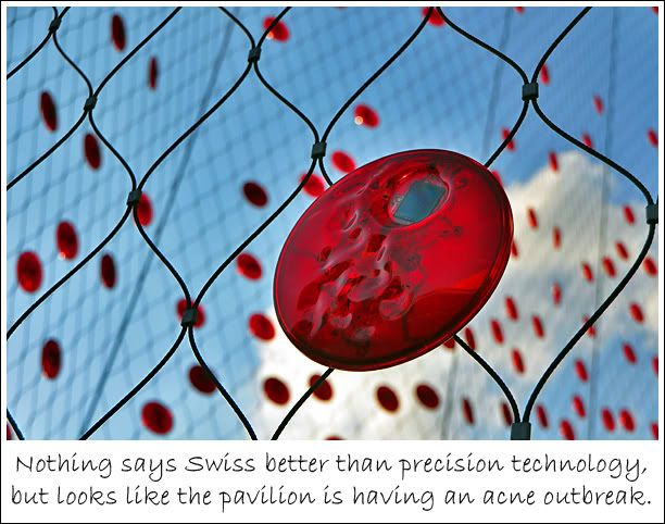
The only disappointment was Switzerland's pavilion which had me scratching my head about its veil of red discs and exhibits that left me feeling shortchanged for the amount of time I queued to get it (about 1.5 hrs). Moreover, its key attraction, an upward-spiralling chair lift system that takes visitors on a roof-top joyride through a planted meadow was under repair. When I realised it took me only 10 minutes to be done with the pavilion, I was like "what the fart luck!".

The Swiss pavilion's aesthetic problem

Anyhoo, here are five of the more interesting pavilions (excluding Spain) among all the European stops I made. Check out the videos for some pretty cool use of projection on unconventional and 3D surfaces.

Unlike video projection onto a flat screen which is very straightforward, these odd shaped projections require careful masking and stitching for the projected show to appear smooth and seamless. So these shows and animated sequences are superb for the technical difficulties they managed to overcome to achieve proportionate realism.

Finland Pavilion

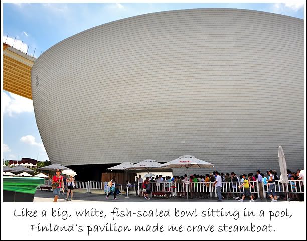
Talk about contemporary Zen on a grand scale and there's Finland Pavilion. Contemporary wha'? Well, there're basically to styles of Zen - the natural-rustic (think rock pools and bamboos); and the contemporary-minimalistic (think white and wide).

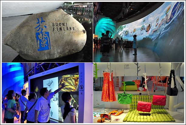
The Finnish pavilion took a little of both elements with its gentle bowl-shaped design embellished with a fish-scale texture sitting on a sheet of water and the country's name carved into a large rock. I felt at once close to nature, but not far from urbanity.

Finland Pavilion

Seen @ Finland

Inside Finland's pavilion, I got visually whisked away by floating dandelions and whimsical bubbles. If you took a digital photo at one of its multimedia kiosks, your face could appear in a bubble gliding across the curved projection screen at the opposite side. Soft, light music chimed the air. Felt kinda enchanting and magical if only I could have the whole place all to myself!


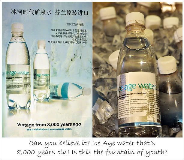
The most interesting find at the pavilion has to be the Ice Age Water. It costs about S$3.00 but I just got to try before the prehistoric pool gets sucked dry. I mean, if it's been trapped for 8,000 years and the size of the pool is finite, how long before it gets depleted?

Do you dare to drink?

But come to think of it, isn't all our water age old? We constantly ask how old our land is, but no one ever asks how old our water is. Water evaporates, forms clouds, falls as rain, snow; forms rivers, oceans, some get trapped underground or as icebergs; gets drunk, becomes pee, evaporates again, come back on earth again... seems like we have a fixed body of water that's been going through the same cycle for as long as time on earth existed. So isn't all our water ice age? Or even older?

So what does Ice Age Water taste like? Just like any other water except that it felt a little denser on the tongue, perhaps from dissolved minerals. It's slightly carbonated and sold ice cold... a delicious relic to cool off in the heat. Less than half an hour later, I returned it to the atmosphere.

Poland Pavilion

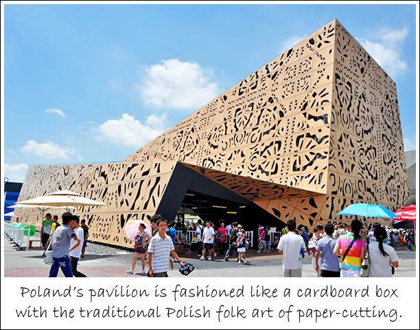
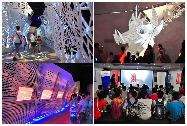
The Polish pavilion reminds me of those 4-sided paper plate lanterns I used to make during early primary school days. I would cut patterns onto the plates, stick different coloured cellophane paper at the back and staple them together. I would make lots of them and place them around my room. A candle in the middle lighted up my creations. I didn't think of fire insurance then.

Poland Pavilion

At first, the intricate cuttings made a beautiful mess. But as I saw more of it running along the walls inside the pavilion, I began to develop trypophobia, which is the fear of looking at tightly packed holes such as a lotus pod or shower head. ('Trypo' is Greek for punching, drilling and/or boring holes.)

Okay, I exaggerated but the holes and patterns got pretty heady after a while. There's even a digital dragon fashioned of papper-cuttings. There's too much frieze going on but the interesting thing about this dragon is that it can actually hear what the audience says and respond accordingly!

Scene @ Poland

There's also a 3D theatre here although the primitive set-up is a world apart from the details given to design outside and wasn't befitting of the hi-tech production. With a small screen, the awe-senseness of the 3D was loss and I'm not sure if it's due to the glasses that were used, but the effect wasn't as jawdropping as the one at the Thai pavilion. The Thai 3D glasses were different. The Polish 3D show had great depth to its animation but didn't have the feeling that things were coming at you.

Portugal Pavilion

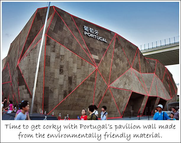
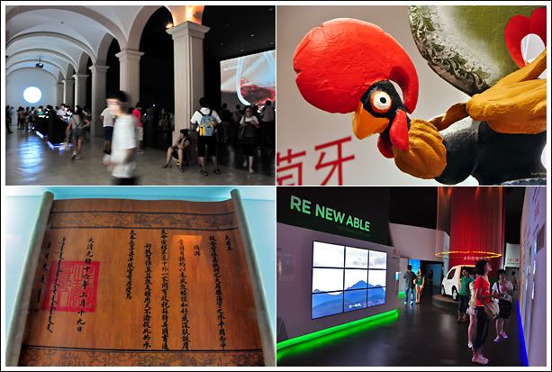
Portugal used cork to build its pavilion's wall not without meaning. With about 52% of the world's cork supply coming from Portugal, it is the world's biggest producer of the material. But beyond the wall, there's little else that could incite curiosity. Except for the clever use of projection to depict the decorative prints of Portuguese porcelain plates.

Portugal Pavilion

While the exterior held an organic charm, the construction theme wasn't carried to its interior, making it seem rather mis-matched. What's missing was also the grandeur one would come to expect of a nation who conquered much of Southeast Asia during the 15th-16th century.

But if the architectural remanants left in Malacca, Macau, India, and even Singapore are anything to go by, the Portuguese could be said to have a very unsophisticated taste in design. And that's reflected in its pavilion.

Scene @ Portugal

The most curious thing fired my imagination at the pavilion was this... the many funky, colourfully painted chickens that decorated its souvenir section and sold as memorabilias. Why is the chicken a national mascot? Could it be due to the similarity in phonetics between 'cock', a male chicken, and 'cork'?


Well, the anatomy that differentiates a man from a woman shares the same name with the male fowl. Let's see them artify that and use it as a national symbol! ;)

That's too risque. So thankfully, there's a delicious alternative to remember Portugal by... the ever delectable Portuguese egg tarts. Especially those from Macau! Drool~~

Luxembourg Pavilion

Sandwiched between Belgium and Germany, I may never get a chance to visit Luxembourg in my lifetime but being at its country pavilion made me feet like I was there. There's an air of Europeanness about it, and the use of live trees sparsely sprinkled with leaves brought a touch of Mediterranean to the summer sunshine.

Luxembourg Pavilion

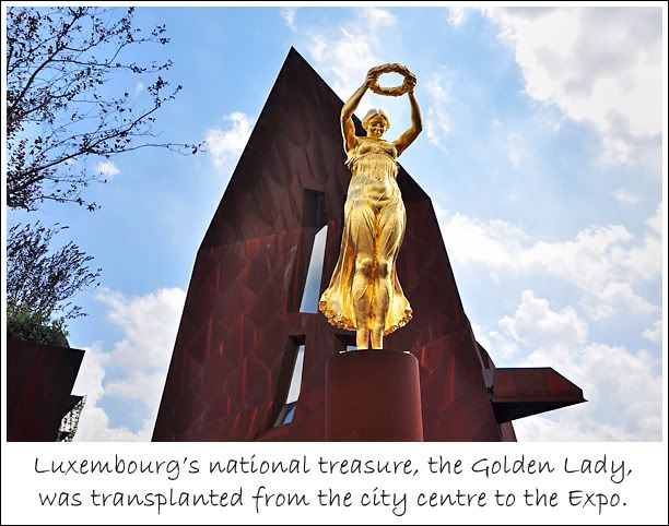
The statue of the Golden Lady gave the European Square a striking human pressence and stood out from the collection of magnificient but impersonal pavilions. I was there at about 2:20pm and managed to take a photo of the sun bursting through the wreath circle. I like that shot alot and you can see it in my earlier post, I Survived World Expo. So if you would like to get the same shot, go around that time.

Scene @ Luxembourg

The exhibits inside the pavilion were very straightforward, nothing eye-popping, but the roof-top area provided a nice vantage point to get an elevated view of the European Square and its surroundings. Although nothing fanciful, visiting this pavilion did feel like a walk in the park.

Czech Republic Pavilion

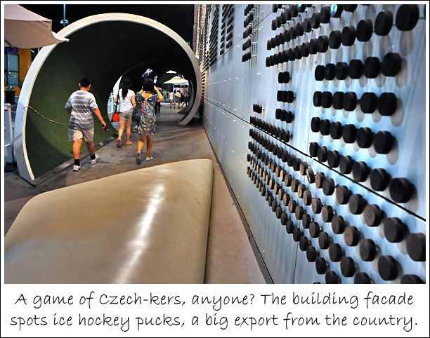
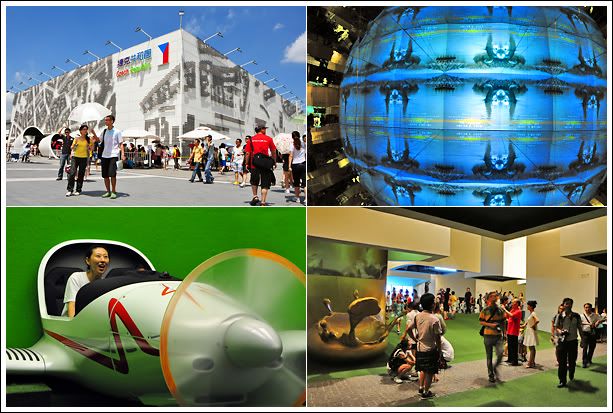
The Czech Pavilion's exterior does not do justice to the exhibits it housed within. It was a wonderland of digital installation art and technology showcase. What's interesting was that quite a number of its exhibits were built overhead, on the ceiling.

Czech Republic Pavilion

The pavilion was a smorgasboard of visual presentations from holograms tracing the evolution of mankind from caves to sqaure rooms, green screen flight simulation, and a host of artistic interpretations of urban living. Quite a lot of things to see here so it was a very worthwhile visit!

Scene @ Czech

I took quite a few videos here but since I've yet to learn how to edit them into a single clip, I'm posting the ones I captured that don't induce motion sickness...


What the Czech Pavilion lacked in external facade design, it makes up for in the plurality of its exhibits. I wish I had more time and covered more European pavilions, but alas, I have to learn to be satisfied with the Czech Pavilion being the best I'd seen in terms of Eurpoean exhibits.

12 September 2010

World Expo 2010 - Spain vs. Brazil Pavilion

The title sounds like something out of the World Cup. But this is another kind of match, one of creativity rather than football, although competition isn’t why the World Expo was held. Yet, having all the countries in one place, it’s hard not to compare.

Although the two countries here hail from vastly different continents, one European and the other South American, I can’t help putting them on the same playing ground because for the life of me, I could never tell the two apart. Maybe it’s the football, maybe it’s the raw cultural energy that they seem to share, and differentiating them is like being able to recognize a Miniature Pinscher from a Chihuahua. Same same but different.

Spain Pavilion

I have to confess that I didn’t do any bit of research about the Expo and the pavilions before the trip. I have not seen pictures, read reviews or even know what I wanted to see. So guided in part by recommendations from my colleagues, the Zone I am in, how a pavilion looks on the outside, and my daily queue-o-meter (a measurement of my tolerance for long queues for that day powered by mood), I embarked on my haphazard discoveries of what lies within the various pods.

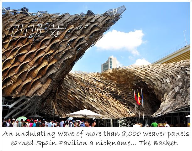
And Spain’s pavilion was a handsome accident. Word-of-mouth by my fellow Expo-mates who’d gone before me enticed my feet there, but what really attracted me was its massive organic architecture, a wicker-basket conception that twists like the flounce of a flamenco dancer.

Spain's interesting Visage

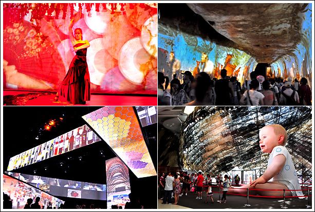
Built around the theme “From the City of Our Parents to the City of Our Children”, the pavilion of the World Cup 2010 holder features 3 exhibit areas – an amazing projection tunnel with a ‘live’ performance of flamenco dancing, a crisscross installation of screens that provided glimpses into the development of Spain, and the biggest highlight of all, a giant baby.

Projection tunnel & giant baby

Sitting at 6.5m tall, the robot baby named Miguelín blinks and coos with expressions of a real child. Some may find it cute, I found it rather creepy. Remember Chucky from Child’s Play? I sure don’t want to be locked up with Miguelín at night.


As a whole, I felt the pavilion looked good but was skimp on contents and didn’t help me understand more about the Spanish culture. The shows were more like moving wallpaper and had no clear storyline. Then again, not all stories must be told in words and images. In Spain’s case, its story is the way the pavilion made you feel.

Brazil Pavilion

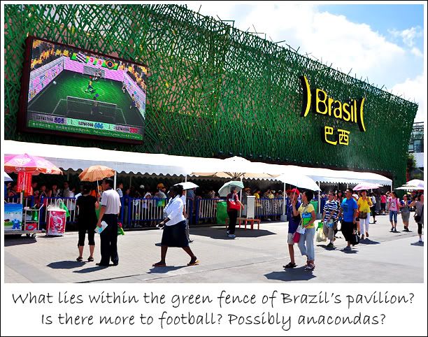
I guess I wasn’t wrong with the decision to share about the pavilions of Spain and Brazil on the same page. I can’t help thinking that the external visages of the two pavilions run along the same eco track. But while Spain presented a dynamic living form of nature, Brazil’s eco-look made me want to take out the lawnmower to convert its neat ‘football field’ into the untamed greens of the Amazon Rainforest. That should up its environmental panache.

Green fence

I visited Brazil Pavilion just hours before my flight back to Singapore. Again, it was one of those pavilions I didn’t plan on seeing but visited because my boss from DigiMagic suggested we take a look.
DigiMagic produces multi-media, as well as experiential media exhibits like those found at the Brazil Pavilion so I guess my boss wanted us to see how our company’s exhibitory technologies can be utilized.

However, whatever exhibitory techniques that were found in the Brazilian pavilion, DigiMagic has produced them one way or another for various galleries, exhibitions and events in Singapore and internationally. So there weren’t any surprises. I wondered why our boss called all the way from Singapore to ‘encourage’ us to see something we’ve already done.

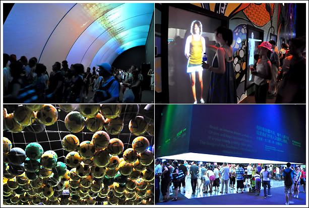
Lots of interactivity

Brazil Pavilion is a house of interactive media. It features various touchscreen and multi-touch technologies (eg. the pinch technology to enlarge and shrink images on smart phones) to create a costume mix-‘n-match game and picture windows to introduce its tourism.

The centre piece of the pavilion is a huge cube projection screen showing snippets of Brazil with a floor projection ala Google map style of its various cities. Personally, I find the floor projection to be a useless piece of visual carpet because all it shows is the roofs of houses and urban spatial planning.
The following videos give an idea of what the main exhibit looks like and an interaction with the tourism info kiosk.


Ironically, with the pavilion’s heavy usage of exhibitory technologies, what left the most impression were the ‘Did you know’ facts that greeted visitors waiting to go into the pavilion. One fact I now know is that The Alchemist by Brazilian author Paulo Coelho holds the record for the most translated book (67 languages) by a living author.

From the eco-inspired pavilion exteriors to their shared passion for football, it’s no wonder I have a hard time distinguishing the two nations. Even after visiting their pavilions, their identities is still a mish-mash in my head. But one thing’s for sure, at this edition of the World Expo, Spain scored a goal over Brazil.

11 September 2010

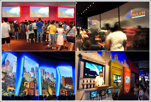
World Expo 2010 - USA Pavilion

With my constant cultural diet of Hollywood, Madonna and KFC, the America Pavilion would’ve naturally been a big draw for me. But I almost didn’t visit the pavilion at all. Being the world’s No. 1 economy, surprisingly, there wasn’t any hype about the USA Pavilion in the line-up of World Expo 2010 must-sees.

Before I visited the USA Pavilion, I wasn’t aware of the controversies and criticisms surrounding it. I found out later that it is 100% sponsored by more than 60 American as well as Chinese businesses and corporations ($0 from the US tax-paying public), and flak was rife for the pavilion’s failure to leave a Titanic impression considering the hefty US$61 million price tag. As much as the biz-wiz paid for the pavilion, it seemed they are also the reason it sank. The inside of the pavilion felt like one big advertisement box.

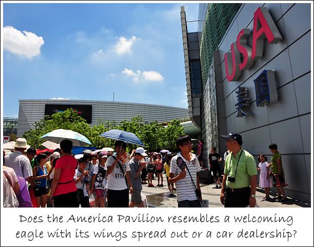
Some like it, some like it not

The pavilion’s design was supposed to be a metaphoric representation of an eagle with its wings widespread but architects and critiques preferred the description – car dealership. I agree, the grey elephant looks like something I can find at Leng Kee.

I queued for about 2 hours to see 3 show clips and a lot of brand logos… that’s how the Americans became the no.1 economy perhaps? A culture and tradition focused on and encouraging consumerism? Well, at least that’s the message I got. Not that that approach is right or wrong. Just that it makes for one rather boring pavilion. From the country who gave us Avatar. Blame it on Hollywood for setting the bar of expectation.

3 shows & a sponsors' showcase

The 3 short films consisted of a welcome clip where everyday American folks tried to speak Mandarin, a filmlet titled the Spirit of America, and a show about working together for a more beautiful urban living environment.

The shows cost US$23 million to produce, which was more than the cost of production for the Oscar-winning movie, The Hurt Locker. Producers of the 3 clips are probably hurt, and stuffed up in a locker by now since investors decried the value of the shows.

Commercial sponsorships drive the USA Pavilion

While I find the USA Pavilion dull, I must say that no one beats the American in crafting it’s message. Perhaps it’s the big brother to the world mentality that the States is used to that its shows harbour broader concepts such as teamwork and partnership.

It’s not so much what USA can do, but what we can do together. As one world. Sounds like a big PR campaign. But one that rings true and masterfully delivered through President Obama, Hillary Clinton and the use of children.

Here’s a short excerpt on the main show which was projected onto a series of 5 unconventional screens.


It just occurred to me that this post about the United States’ pavilion is posted on September 11. May the grim anniversary reminds us all that harmony and tolerance is not a God-given, but man-driven. Maintaining peace is a lot of hard work!

10 September 2010

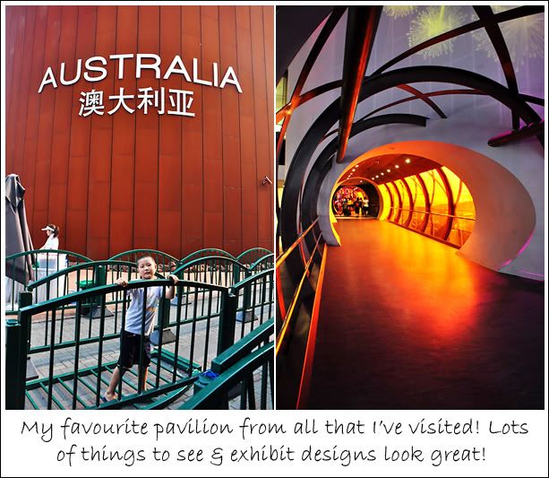
World Expo 2010 - Australia Pavilion

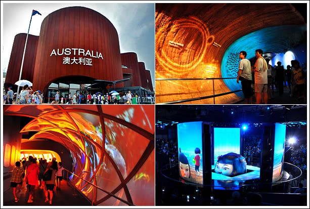
The Australia Pavilion is the icing on my World Expo cake. It is my favourite because of its ability to generate interest in the Australian heritage with cool exhibit designs, having a visual surprise at ever turn, and a wowderful 360 degree revolving screen.

Australia Pavilion

The pavilion design made me drool. I'm reminded of a huge piece of chocolate confectionery, a brown Tiramisu cake or a curved assembly of Royce' Chocolates. And thankfully, the interior design and decor look as delicious as it does on the outside.

Aussie scene

Probably the most memorable part of the pavilion is the segment on Australian modern history and iconic developments treated with a big dose of humour! Instead of the usual serious and corporate sounding video or print panel introductions, the Aussies built a tunnel of caricature sculptures that depicts the nation's founding, agricultural tradition, and evolution into the great country it is today. The light-heartedness tore away the bore of historic ramblings.

A taste of Aussie humour

But the most spectacular of all is the main show at the pavilion. It features a 360 degree rotating screen that emerges from the floor with ambient lights coordinated to the pace and energy of the show contents. It was a pretty amazing experience watching it for the first time (I saw it twice). Below is a video on a part of the show to let you have an idea about its ingenuity. But nothing beats seeing it 'live'!

02 September 2010

World Expo 2010 - ASEAN Pavilions

Of the more than 200 country pavilions and themed pavilions, I visited only 30 of them. That’s less than a quarter of this phenomenal event, but it was still plenty to experience, record and learn from. So since I started talking about the country pavilions with Singapore’s participation, I thought I’d follow up with a review of the pavilions by the other 9 members of the Association of South-East Asian Nations (ASEAN) – Malaysia, Brunei, Indonesia, Philippines, Thailand, Vietnam, Laos, Cambodia, and Myanmar.

As with the thoughts about the Singapore Pavilion and all subsequent posts about pavilions, I have to qualify that the opinions expressed are merely based on my personal experiences as a visitor. Just as we all have a different vision of what a perfect world should be, so will opinions vary on what makes a pavilion worthy of visit.

While some pavilions left a lasting impression on me, others failed to pique my interest. And having seen 30 of them, my basis of comparison while limited, draws on after-thoughts about what was interesting and what was as interesting as watching paint dry.

But one thing I do keep a look out for is the feel of a pavilion’s character and personality. That X-factor. Its gusto. Its voice. Does it read me a fascinating and unforgettable tale of the country it represents, or is it a textbook narration of its history, sociology, economy, anthropology, political ideology… zzzZZZzzz… zzzzzz…

In other words, is the pavilion a Nerd? A Stud? A Plain Jane, or a Beauty Queen? Well, here are 9 Asian pavilions I shall attempt to characterize and they are arranged in the order from Z to X…

Brunei Pavilion

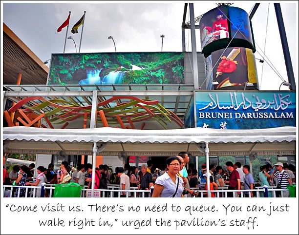
My very first step on the pavilion arena on the very first morning was at Zone B’s Asian Square. The Singapore Pavilion was directly across and I was next to the Brunei Pavilion. While I was standing there, stopped in my tracks by encountering the larger-than-life pavilions for the first time, trying to comprehend the awesomeness of size and space all around, forgetting to breathe… and my reverie got interrupted by a female voice hawking a pavilion.

Brunei Pavilion

Sounded almost like a lelong at a pasar malam. In all my 3.5 days visiting the Expo, I didn’t hear any other pavilion being touted this way. I didn’t succumb to the tempting invitation of ‘no queue’ and visited Singapore first. When I returned to visit Brunei after lunch, there was still no queue. And the female staff was still advertising.

I walked right in to Brunei Pavilion and I liked it. It was a burning 38°C outside and I liked that the spaciousness and lack of crowd kept the air-conditioning cold. Yup, that’s about it. The pavilion was good only for enjoying some air-con.

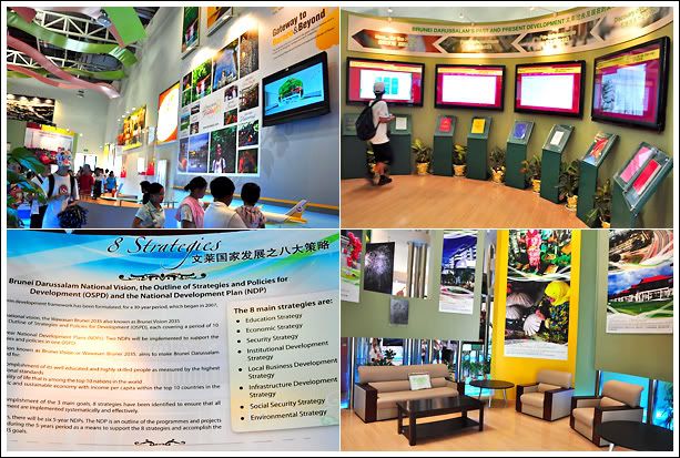
Standard fare

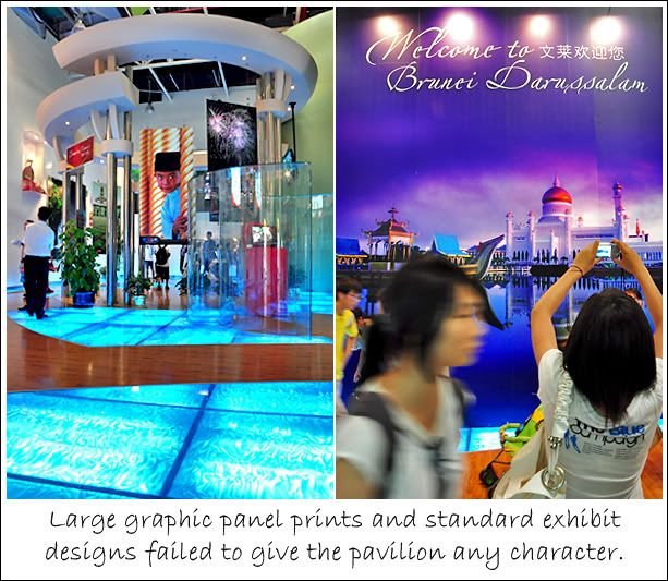
After I went one round of its exhibits, I understood why there was no queue. There wasn’t anything much to see. The pavilion was bright and neat with the deployment of standard exhibition panels, shelves and plasma TVs to loop touristy videos. The one eye-catching thing was the blue-lighted floor designs that I assume represented water since the pavilion’s theme was something to do with nature.

Brunei 3

Brunei is a pretty rich country so it’s kinda surprising that the pavilion looked like it didn’t require much financial effort. Moreover, the choice of exhibition topics such as the plain listing of the 8 national strategies of development was too academic.

Character : Nerd married to Plain Jane

Laos Pavilion

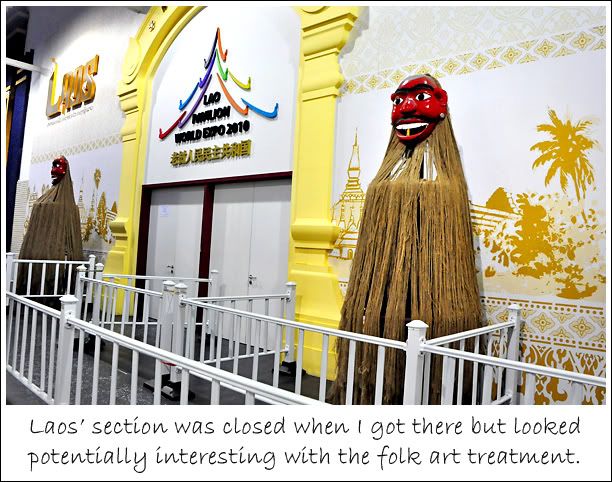
Laos shared a pavilion with Myanmar in Zone B's Asia Joint Pavilion III. I was there around 9:00 pm and it was closed by then. I hadn't planned to visit the 2 pavilions but wandered into their shared space unwittingly.

Laos Pavilion

Though I didn't get to see what's inside, the attempt to dress-up and represent its culture at the entrance even though it's just a very small exhibition area seemed to hold a promise of not too shabby contents inside.

Character : Jock (potentially)

Myanmar Pavilion

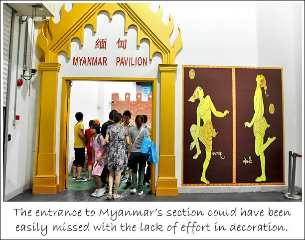
I popped by Myanmar's section on the way out of AJPIII and it was really plain. It felt more like an exhibition booth rather than to be classified as a pavilion. I always have a soft spot for Myanmar because of the controversy surrounding Aung San Suu Kyi's 14 years of house arrest imposed by the Burmese military junta. I hope to visit the home country of this moder-day freedom fighter one day.

Myanmar Pavilion

One of the 4 Southeast Asian nations with the unsavoury association to the Golden Triangle (an illegal opium-producing area that spans Vietnam, Laos, Thailand, and Myanmar), the country's culture is greatly influenced by its surrounding neighbours, especially in religion.

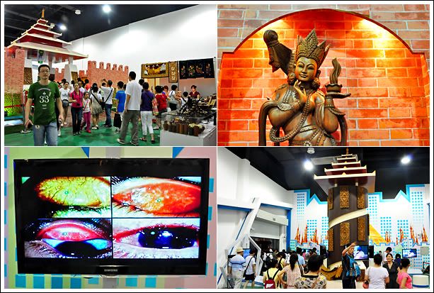
Myanmar scene

One of the most interesting things to see at the pavilion was the intricate wood carvings of celestial beings and Taoist deities such as Nuwa (女媧), who's believed to have made mankind from clay. However, their display couldn't have been more inappropriate. They were really beautiful works of art crowded unceremoniously together on shelves and on the floor.

But the most atonishing exhibit of all would be the brutal honesty in presenting the nation's health program. I can't hear what was being said but the uncomfortable images depicting surgery and various stages of eye diseases really stood out at the World Expo where only beauty has a place in the sun.

Character : Plain Jane

Malaysia Pavilion

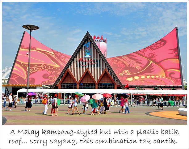
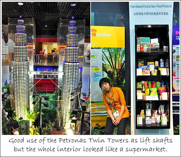
When contemplating the Malaysia Pavilion, this saying kept flashing in my mind… “Good from far, far from good.” In a distance, its arches bit an impressive crescent against the skyline. But the closer I got, the more it loses its magic. And once inside, I kept having the urge to look for a shopping basket or trolley. Felt like I entered Carrefour.

Malaysia Pavilion

Being a bridge away from Singapore, Malaysia is my most visited country. And I like going there for its eclectic conglomeration of urban built-ups dipping their feet in the rooted heritage of colonial structures, old shophouses and five-foot ways. Of course Singapore has this kind of scene too, but in Malaysia, it just feels more authentic. Besides, our neighbour has lots of natural, untamed reserves to explore.

Pavilion set-up

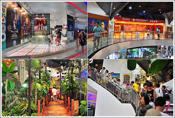
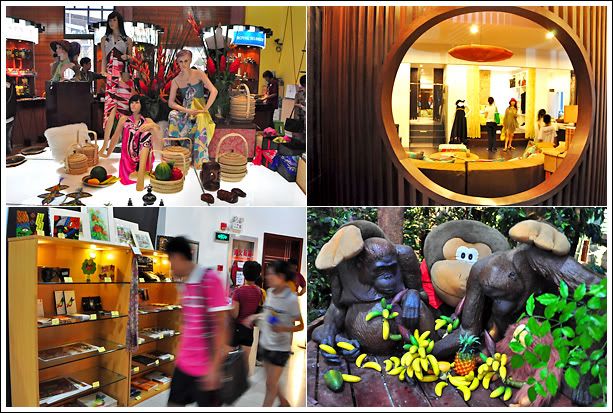
I can see that the pavilion tried to capture Malaysia's multi-faceted charm. Unfortunately, it turned out to be nasi lemak without the coconut milk; it had the look, but not the flavor. There’re too many prints and not enough real artefacts. Even the ‘forest’ was made up of plastic trees and plants which made it look more of a handicrafts store, less of a tropical rainforest paradise.

Supermarket interior

When visiting the pavilion, one of the interior plan that made me scratch my head was a staircase linking the first floor to the second. It’s one staircase for going up and down so it got pretty crowded and I was stuck in the human traffic for a while half-way up the steps. Such a smart design. Or maybe the creators didn’t anticipate such a huge crowd.

Malaysia scene

The 2nd level was somewhat of a cocoa showroom with some half-baked exhibit to explain the cocoa-making process and a cocoa drink sampling counter. Sales was brisk. Moving from the supermarket section of the pavilion, we come to the home and décor section with a stylishly designed modern-Malaysian living room, bedroom and bathroom.

There was another small exhibition of art and craft that seem like an afterthought, and more retail and souvenir counters around. The pavilion’s theme was 1 Malaysia. Well, it sure was the 1 place to shop.

Character : Nerd

Cambodia Pavilion

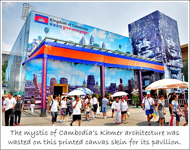
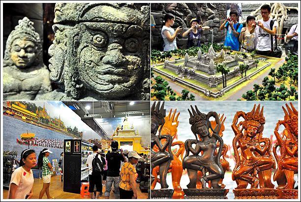
Here’s a diamond in the rough. The pavilion’s exterior was nothing to shout about but the interior was lavish with the cream of what put Cambodia on the tourist map. Perhaps that’s the strategy of the pavilion, to trick visitors into having low expectations and then wow them.

Cmmbodia Pavilion

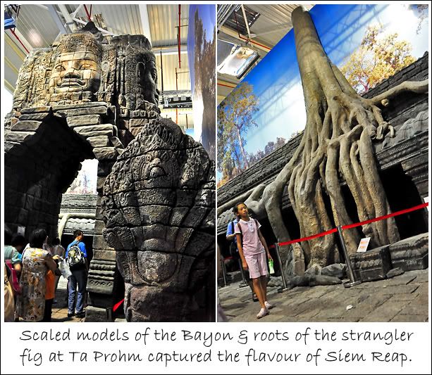
Although more could have been done to hide the exposed ceiling to create a more engrossing feeling of being Lara Croft, but the thrill of seeing partial replicas of the famous architectural relics in Siem Reap made up for it.

Siem Reap replicas

There was the Cambodian Naga, the smiling face from the Bayon, the gigantic roots of a strangler fig at Ta Prohm, and a model of Angkor Wat. It momentarily brought back memories of Siem Reap through the excitement of recognizing what was being replicated. If you would like to know about my Siem Reap adventures, please click here.

Cambodia scene

While the Cambodia Pavilion wasn’t very big, it really gave visitors a glimpse of what’s it like to visit its many UNESCO World Heritage sites of towering temples and ancient carvings.

Even the small space within the pavilion worked to its advantage because that’s how it felt within the walls of the ancient structures. The pavilion was a time capsule.

Character : Jock in drag as Plain Jane

Philippines Pavilion

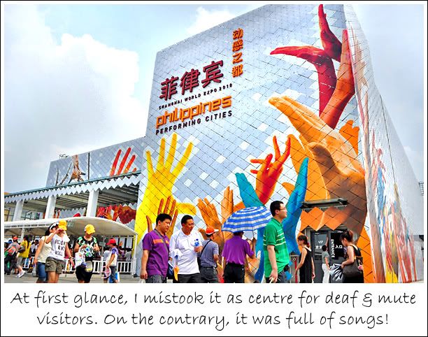
When I first glanced around the Asian Square, I thought the Philippines Pavilion was actually an administrative centre for deaf and mute visitors because of the hands printed on the walls. I mistook them for sign language.

Then I realised it was Philippines' pavilion to the theme of Performing Cities. The pavilion design looked rather bland during the day. Even when it was lighted up at night, it didn't have any jaw-dropping effect.

Philippines Pavilion

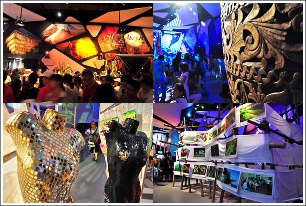
There wasn't a queue so I got in pretty quickly and it immediately felt like I entered a club or live band lounge of some kind. Serve up some alcoholic concoctions and the whole experience would be perfect!

Club scene

There was a main stage where dance and musical performances took place and other performing platforms for the showcasing of the Filipinos' innate talent in singing. Apart from watching liveshows, the pavilion offered a collection of Filipino art laid out in a casual and accessible manner. If only there was an open bar in there...

Character : Jock

Vietnam Pavilion

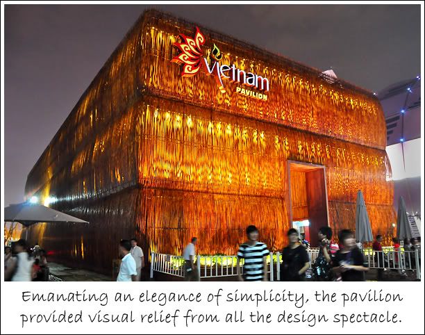
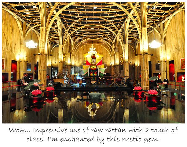
Sitting next to the AJPIII (which housed Laos and Myanmar's pavilions) in zone B, Vietnam's pavilion was easily the most impressive in terms of building material. The quaint little pavilion made up of bamboo and rattan incites a sort of calm without the use of minimalism, a visual style that often personifies Zen.

Vietnam Pavilion

I hadn't planned on visiting Vietnam Pavilion but it turned out to be a very pleasant and delightful encounter. I simply love the way it looked on the outside and inside (although the interior did remind me of a prayer hall).

Inside the pavilion

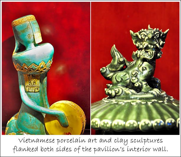
There was practically nothing to read in the pavilion about Vietnam except for the interpretative messages about its culture from the many huge vases and art sculptures.

Art & decor

Somehow, I can't help but feel that the Vietnamese preferred not to pen down a definition of what is life, but to let it be an open exploration with each visitor forming his/her own meaning through the country's pieces of art. But one thing's for sure, religion plays a big part.

Character : Beauty Queen

Indonesia Pavilion

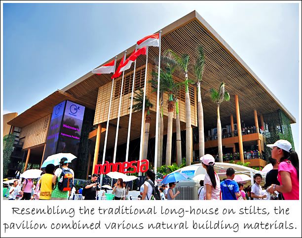
My first impression was that the Indonesian pavilion looked kinda bare with a whole lot of empty space. The open concept defied my early preconceived image of what a pavilion should look like... that it should have 4 walls enclosing all exhibits and design elements. But the pavilion was hollowed out for outsiders to look into its various levels and layout.

Indonesia Pavilion

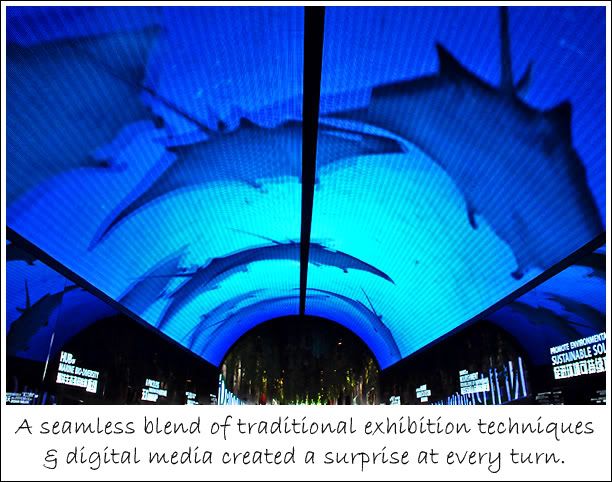
With so much 'empty space', I imagined that the pavilion won't have much to showcase, but the pavilion was one of the more interesting ones to visit in terms of the richness of content and variety of exhibitory techniques. There was a surprise at every turn!

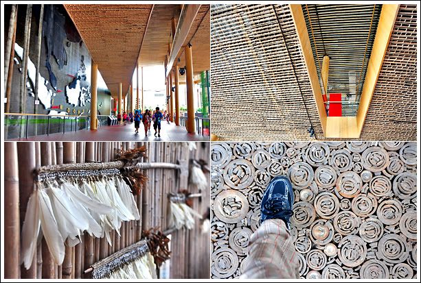
Natural texture

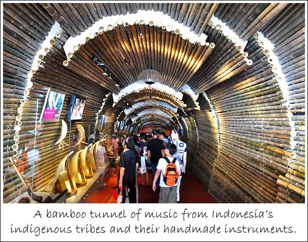
At 4-storeys, the pavilion was the tallest at the Asian Square and was really effective in communicating its environmental leanings. An interesting feature was the combination of various natural building materials such as bamboo, palm leaves, and wood chips for the pavilion's walls, flooring and some fixtures.

Nature & technology

Bamboo all the way

Of all the pavilions, I thought Indonesia was the most successful in synthesizing nature with technology to create a seamless journey in discovering Indonesia's native natural-scapes as well as digital edge.

Character : Jock best friends with Nerd

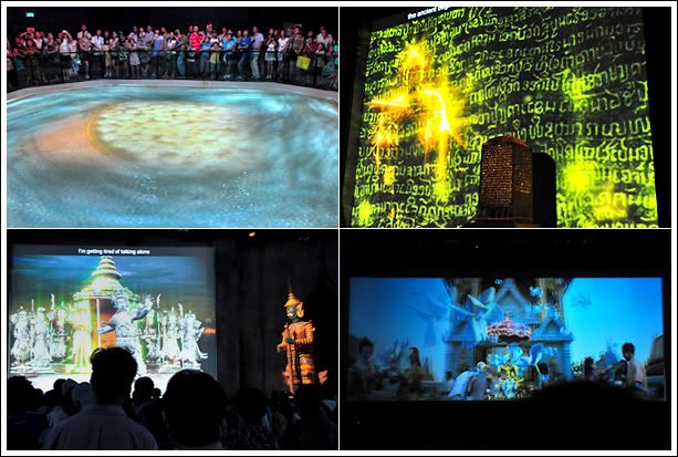
Thailand Pavilion

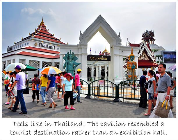
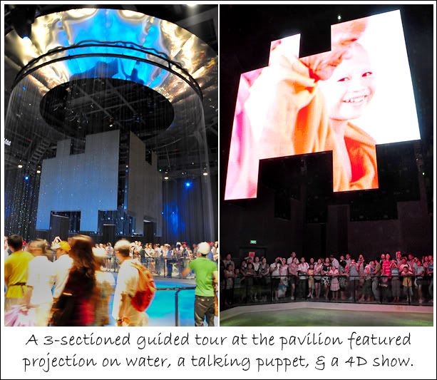
The Thai pavilion was my favourite amongst the ASEAN gathering in terms of entertainment value, ability to wow, and leaving a lasting impression. A guided visit with 3 shows in 3 different theatrical format, the pavilion was definitely worth the 2-hours queue time.

Once visitors entered the pavilion, they were greeted by an animation of the pavilion's mascot, Tai, while waiting for the first theatre doors to open. It endeared itself to the visitors through a very lively but brief introduction about Thailand and the pavilion. Tai appeared again later in another show segment about Thai history and diplomatic ties with China.

Thailand Pavilion

When I stepped into the first theatre, I could hear grasps. Before us was a large water curtain cascading into a pool below. The sound of water splashing filled the room. The show was projected onto 4 screens shaped like jigsaw pieces (although I felt the odd shape wasn't necessary) in the middle and onto the pool.

Vertical fountain

After the show, we were directed to a second theatre that featured projection on 3 sides and a huge, animatronic puppet Indrajit, the mythological warrior that stands guard at the entrances of many Thai temples.

The interesting part about this second show was the interaction between the puppet with the projected animation of Tai and what looked like Guan Gong, the Chinese god of war. The 3 characters talked to each other and created a multi-textured presentation.

Great shows

The last theatre played a 4D show. We're all familiar with 3D by now and the fourth D is the addition of real physical experiences that complimented a show's content. In Thailand's case, I felt wind blowing in my face when the show talked about beaches, sprinkles of water when the scene showed rain, and the smell of fragrant jasmines when a basket of the flower was tossed into the air. Amazing experience! Love the pavilion as much as I love visiting Thailand.

Character : Jock married to Beauty Queen
Related Posts Plugin for WordPress, Blogger...